With Apple’s recent release of iOS14, there have been a number of new features added to the iPhone. As someone who finds tremendous satisfaction in Instagram pages with specific color themes, changing her Spotify playlist images to be the same color scheme and coordinating my lockscreen with the color of my phone, I was ecstatic when videos of people’s customized phone pages started popping up on my Instagram page. Using “widgets” I have more photos of my favorite K-Pop groups on my home screen. With “shortcuts” I can change the icons of my applications (apps) to match the aesthetic of my phone background, as well as get rid of the pesky red notification circle.
More than that, these changes are functional, allowing me to easily check the weather, my phone battery and the date. In iMessage, the ability to pin group conversations helped me immensely with finding important school-related conversations buried within my personal messages. Within these chats, being able to reply to specific messages eases the process of answering a question asked ten messages ago and “tagging” specific people for their opinion helps make sure no one gets left out.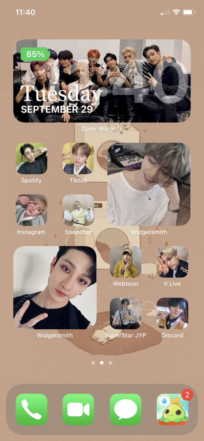
So one Saturday morning, I layed in my bed as I reorganized my phone and familiarized myself with the new features. Due to the customizability of widgets and shortcuts, I have been able to find the perfect blend of aesthetic and functional. I lay out my phone into three pages: a “home page,” a “functional page” and an “everything else” page. Throughout these pages, I have added custom widgets with thematically-grouped photos of my favorite K-Pop idols. When I’m stressed, it’s easy to simply unlock my phone and smile down at cute photos and my favorite song lyrics.
My “home” page, my center screen, houses my most used social media and gaming apps. These are the apps which I created shortcuts for, as I use them often and leave them laid out in the same format, allowing me to easily identify which app is which despite the lack of identifiable logos. Meanwhile, the page of the left is a “functional” page. These house my productivity related apps such as Slack, Gmail and Google Maps. Since all the apps on this page are coincidentally white with red, green and yellow accents, I have left them alone since they coordinate with each other, also allowing me to identify them easier. The “everything else” page houses a group of school-related apps as well as hides the apps which I have created shortcuts for.
Despite my love for my new phone layout, there are a few details that irk me. Unfortunately, a lot of the aesthetically pleasing widgets require downloading third-party apps. Further, since these are not Apple-created widgets, there’s white text below them to indicate what app I used to add them to my screen, creating an awkward space below my widgets. Meanwhile, using shortcuts adds the time it takes to open my apps, as it opens the shortcuts page before it opens the app itself. In iMessage, pinned group conversations no longer appear in the list with your other messages, causing me to panic when I’m looking for new messages from my chats. However, this may be some user confusion and will be fine as I continue to adjust to iOS14.
As Apple releases more updates to iOS14, I look forward to more customizable features to widgets like those provided by third-party apps and even widgets for apps such as Apple Music, Soundcloud, and Spotify. I also hope they shorten times to open apps using shortcuts and continue to work on the User-Interface Design in iMessage.
In the meantime, I’ll be in the corner, happily smiling down at my phone screen.
The views in this column do not necessarily reflect the views of the HiLite staff. Reach Tessa Collinson at tcollinson@hilite.org. Read more of Tessa’s works here.













![AI in films like "The Brutalist" is convenient, but shouldn’t take priority [opinion]](https://hilite.org/wp-content/uploads/2025/02/catherine-cover-1200x471.jpg)






![Review: “The Immortal Soul Salvage Yard:” A criminally underrated poetry collection [MUSE]](https://hilite.org/wp-content/uploads/2025/03/71cju6TvqmL._AC_UF10001000_QL80_.jpg)
![Review: "Dog Man" is Unapologetically Chaotic [MUSE]](https://hilite.org/wp-content/uploads/2025/03/dogman-1200x700.jpg)
![Review: "Ne Zha 2": The WeChat family reunion I didn’t know I needed [MUSE]](https://hilite.org/wp-content/uploads/2025/03/unnamed-4.png)
![Review in Print: Maripaz Villar brings a delightfully unique style to the world of WEBTOON [MUSE]](https://hilite.org/wp-content/uploads/2023/12/maripazcover-1200x960.jpg)
![Review: “The Sword of Kaigen” is a masterpiece [MUSE]](https://hilite.org/wp-content/uploads/2023/11/Screenshot-2023-11-26-201051.png)
![Review: Gateron Oil Kings, great linear switches, okay price [MUSE]](https://hilite.org/wp-content/uploads/2023/11/Screenshot-2023-11-26-200553.png)
![Review: “A Haunting in Venice” is a significant improvement from other Agatha Christie adaptations [MUSE]](https://hilite.org/wp-content/uploads/2023/11/e7ee2938a6d422669771bce6d8088521.jpg)
![Review: A Thanksgiving story from elementary school, still just as interesting [MUSE]](https://hilite.org/wp-content/uploads/2023/11/Screenshot-2023-11-26-195514-987x1200.png)
![Review: "When I Fly Towards You", cute, uplifting youth drama [MUSE]](https://hilite.org/wp-content/uploads/2023/09/When-I-Fly-Towards-You-Chinese-drama.png)
![Postcards from Muse: Hawaii Travel Diary [MUSE]](https://hilite.org/wp-content/uploads/2023/09/My-project-1-1200x1200.jpg)
![Review: "Ladybug & Cat Noir: The Movie," departure from original show [MUSE]](https://hilite.org/wp-content/uploads/2023/09/Ladybug__Cat_Noir_-_The_Movie_poster.jpg)
![Review in Print: "Hidden Love" is the cute, uplifting drama everyone needs [MUSE]](https://hilite.org/wp-content/uploads/2023/09/hiddenlovecover-e1693597208225-1030x1200.png)
![Review in Print: "Heartstopper" is the heartwarming queer romance we all need [MUSE]](https://hilite.org/wp-content/uploads/2023/08/museheartstoppercover-1200x654.png)
