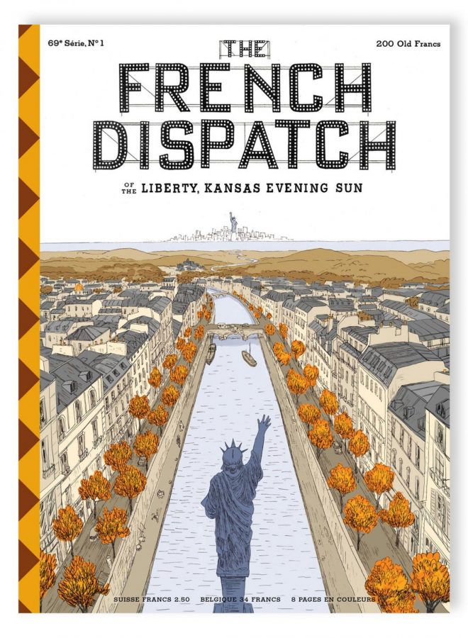
There are very few directors with a style as easily recognizable as Wes Anderson’s. Anderson is the strange example of a director whose style is outside of the mainstream and yet gets recognition, attention and big stars anyways. Could Gregg Araki release an anthology film told from different perspectives and hope to get Bill Murray? Do you even recognize that name? Probably not, and yet Wes Anderson can and does, to beautiful results.
The most remarkable thing about The French Dispatch is its concept. A film set in 70’s France containing several stories set to be published in a newspaper of the same name based in Kansas, for some reason. The film touts an obituary, a travel log and sections on art and politics, there is even a nod to comic strips in a story under the cuisine section. It’s an incredibly fun concept, and one that continues Anderson’s new found fascination with strange framing devices like those he plays around with in the Grand Budapest Hotel, a film starting in the film’s universe, then following a book, then a flashback and then a man’s retelling of an old friend’s life. It’s one of my favorite elements of Anderson’s style, giving him excuses to twist and alter the aspect ratio of the film, forcing him out of his comfort zone and to play around and risk a bit more if he is to deliver on his signature symmetric and poppy style.
Here, Anderson doesn’t merely touch on his aspect ratio, no, again he does what perhaps no other director could dare do in a big studio movie, he plays around with color. He plays around with color a lot.
The film is, if not around half then, mostly black and white. Forcefully removing Anderson from his much beloved trademark of bright and poppy colors. While naturally Anderson is still up to his old tricks of symmetric framing and his distant camera, the lack of color removes the crutch of eye candy that many critics accuse Anderson of leaning too hard on, and instead places emphasis on the writing, which, as a fictional newspaper, the film is brimming with in plenty of style. Pun intended.
And boy, that writing style has to be my favorite part of the film. Being narrated by journalists, each story has a sort of pompous, pretentious style to it, one that only slightly borders on parody, but is bathed in enough Wes Anderson charm that the line is pretty blurred. Some such as Roebuck Wright drone on and on about detail in a way that makes your head fuzzy, while J.K.L Berensen, loads her art lecture up with all sorts of context that, while appreciated, isn’t really necessary. I loved every bit of it. I love that Anderson leans more into writing, to create and emulate styles of writing one could only hope to find in novels in a way that isn’t just quirky for the sake of being quirky, but acts as an endearing characteristic of these journalists.
Perhaps that could be said to be the films through line, a deep love for all it covers. The artist covered is a lazy brutish criminal. The art dealer is a greedy, self absorbed man who doesn’t care that much about art. Timothée Chalamet’s student protester seems to care more about getting with a girl he likes than the movement, and of course none of the journalists fulfill their assignments correctly, going over word counts or focusing on the wrong angles. The film presents all of its characters, perhaps even the country as well, as these flawed and selfish people, yet suggests that is their beauty. The student protestors fly into the sky like a “comet” on their young love, the journalist and the editor understand each other after a brief conversation regarding the assignment. This too carries on Anderson’s now familiar themes of love for nostalgic eras, but here, thanks to restrictive color, it is front and center in a way it never was before.
And yet, there are moments in these black and white short stories where color pops only to then sneak away. In The Concrete Masterpiece colors appear to show the artist’s latest work, or in The Private Dining Room of the Police Commissioner a woman’s blue eyes peek through a hole in the wall for a questioning boy. In both scenes, the film quickly returns to a monochrome palette. Anderson makes these certain moments shine and stick in ways they never quite seem to in other Anderson films. And of course the film never carries through all of this in an over the head, “you’re dumb for not appreciating me!” Kind of way so many films try, but rather with a playful laugh, always with rather silly, or plain dumb, situations that are played with a straight face.
There are so many jokes that are almost hidden in this straight faced playfulness. Students protest the institution via checkers. A story that is supposed to be about cuisine devolves into a literally cartoonish chase after a kidnapped boy. An art lecturer apologizes as a nude picture of her finds its way on her slideshow. In most circumstances, it’s almost tempting to reduce this as a weird attempt at charm, but here, due to the serious ways our vain characters carry themselves, it seems almost like an endearing love letter to everything they represent.
The first story, the travel log narrated by Owen Dennis’s character, has perhaps the most telling openings to any of the stories lingering in the film. Right before Dennis’s character speaks about all the thugs, destruction and pollution that riddles the fictional town of Ennui, the camera sits and watches the town in the morning. A woman beats her rug through the window, a man simply smokes nearby, all sorts of people are doing all sorts of things as the town wakes up. The camera merely watches it all, recording this tiny moment that would otherwise be lost to time, with affection. It being in color designates it as an important moment, if the long take wasn’t enough. While no doubt beautiful, Anderson doesn’t quite inject the shot with his trademark style, instead allowing the moment to pass as it is, acting as a beautiful thesis statement.
MUSE provides monthly curations of all types of arts, authors, and media. On top of author analyses, there’s also the occasional rant-filled review. We hope readers will always leave with a new piece of media to muse over. Click here to read more from MUSE.








![AI in films like "The Brutalist" is convenient, but shouldn’t take priority [opinion]](https://hilite.org/wp-content/uploads/2025/02/catherine-cover-1200x471.jpg)














![Review: “The Immortal Soul Salvage Yard:” A criminally underrated poetry collection [MUSE]](https://hilite.org/wp-content/uploads/2025/03/71cju6TvqmL._AC_UF10001000_QL80_.jpg)
![Review: "Dog Man" is Unapologetically Chaotic [MUSE]](https://hilite.org/wp-content/uploads/2025/03/dogman-1200x700.jpg)
![Review: "Ne Zha 2": The WeChat family reunion I didn’t know I needed [MUSE]](https://hilite.org/wp-content/uploads/2025/03/unnamed-4.png)
![Review in Print: Maripaz Villar brings a delightfully unique style to the world of WEBTOON [MUSE]](https://hilite.org/wp-content/uploads/2023/12/maripazcover-1200x960.jpg)
![Review: “The Sword of Kaigen” is a masterpiece [MUSE]](https://hilite.org/wp-content/uploads/2023/11/Screenshot-2023-11-26-201051.png)
![Review: Gateron Oil Kings, great linear switches, okay price [MUSE]](https://hilite.org/wp-content/uploads/2023/11/Screenshot-2023-11-26-200553.png)
![Review: “A Haunting in Venice” is a significant improvement from other Agatha Christie adaptations [MUSE]](https://hilite.org/wp-content/uploads/2023/11/e7ee2938a6d422669771bce6d8088521.jpg)
![Review: A Thanksgiving story from elementary school, still just as interesting [MUSE]](https://hilite.org/wp-content/uploads/2023/11/Screenshot-2023-11-26-195514-987x1200.png)
![Review: "When I Fly Towards You", cute, uplifting youth drama [MUSE]](https://hilite.org/wp-content/uploads/2023/09/When-I-Fly-Towards-You-Chinese-drama.png)
![Postcards from Muse: Hawaii Travel Diary [MUSE]](https://hilite.org/wp-content/uploads/2023/09/My-project-1-1200x1200.jpg)
![Review: "Ladybug & Cat Noir: The Movie," departure from original show [MUSE]](https://hilite.org/wp-content/uploads/2023/09/Ladybug__Cat_Noir_-_The_Movie_poster.jpg)
![Review in Print: "Hidden Love" is the cute, uplifting drama everyone needs [MUSE]](https://hilite.org/wp-content/uploads/2023/09/hiddenlovecover-e1693597208225-1030x1200.png)
![Review in Print: "Heartstopper" is the heartwarming queer romance we all need [MUSE]](https://hilite.org/wp-content/uploads/2023/08/museheartstoppercover-1200x654.png)


