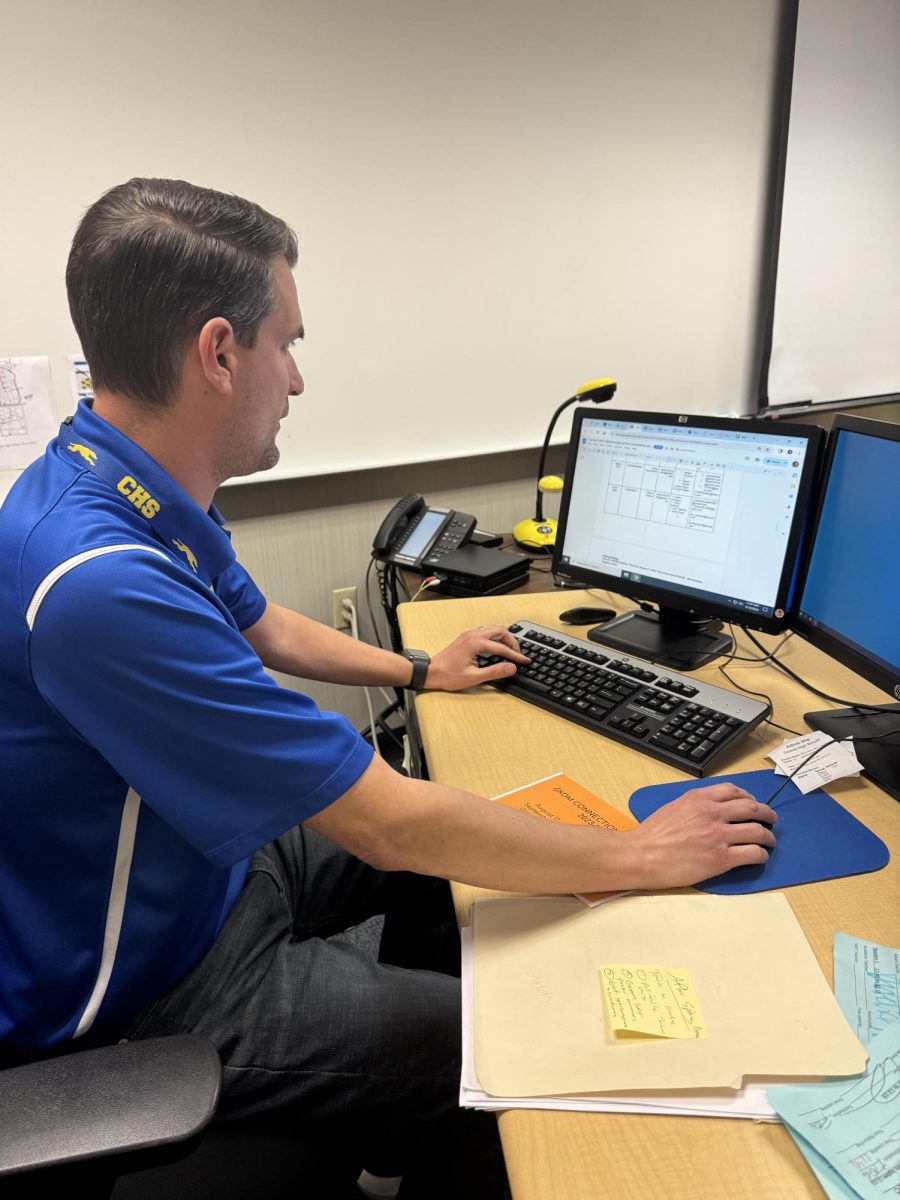
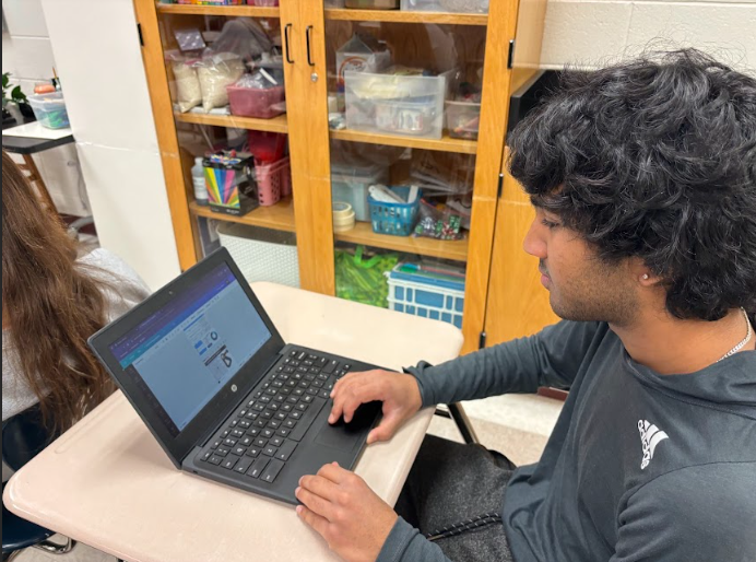
As of late, students, staff and administration here have been upgrading almost every technological aspect of the school to much success. Canvas has allowed access to files and documents for students on a computer or phone and has provided more technology-based options for teachers. PowerSchool gave the gradebook system a long needed overhaul, allowing students to get much faster updates on their grades and a new app to check and get notifications about those grades. However, the new school website still needs some work.
That isn’t to say the website does everything wrong. The new website looks much better and feels like a more modern site compared to the old one. The anchored images for often-used items like Canvas and PowerSchool, and the minimalist look and use of buttons instead of linked patches of text make the site seem much cleaner. The addition of the Twitter feed and the preview calendar also make tasks like checking if there is a football game or whether school is canceled much quicker.
Beyond that though, the new site is harder and slower to use than the old one. Everything on the site is a bit too large which leaves a lot of space either unfilled or filled with something far too big for what it does. A good example of this is the new staff directory. On the old site, the directory was concise and simple, giving users a simple way to search and a clear table telling you name, position, email and website (before Canvas was introduced). It didn’t look amazing, but with a link on CHS’s home page and an easy-to-use search bar, a student could find a teacher’s information in seconds. Now, however, even finding the link to the staff directory can take some time due to it being the last option under the “About” tab rather than clearly labeled on the home page. Once a user searches a or part of a name in the search box (which on a phone is at the bottom of the page), the page presents the information in a box with so much space around it that a user can, at most, look at only four staff members at a time on a phone. Not only that, but once you find the staff member, their email will now be a miniature mail envelope that, when clicked, attempts to redirect users to their preferred mailing app. This works great on a phone, but on a public computer or computer without a set up mailing program, this almost never works, and users aren’t provided with a copy-and-pastable version of the email to use elsewhere.
We recognize the need for CHS to have a website that looks good, works well and is easy to navigate, and many of the changes to the site have been positive. However, as we move forwards, several small tweaks—simply condensing everything, leaving less white-space around information and reorganizing elements with students’ interests in mind could continue to make a good product even better.








![British royalty are American celebrities [opinion]](https://hilite.org/wp-content/uploads/2024/03/Screenshot-2024-03-24-1.44.57-PM.png)





![Chelsea Meng on her instagram-run bracelet shop [Biz Buzz]](https://hilite.org/wp-content/uploads/2024/04/IMG_2446-1200x838.jpg)
![Review: Quiet on Set: The Dark Side of Kids TV is the long awaited exposé of pedophilia within the children’s entertainment industry [MUSE]](https://hilite.org/wp-content/uploads/2024/04/unnamed.jpg)
![Review: “The Iron Claw” cannot get enough praise [MUSE]](https://hilite.org/wp-content/uploads/2024/04/unnamed.png)
![Review: “The Bear” sets an unbelievably high bar for future comedy shows [MUSE]](https://hilite.org/wp-content/uploads/2024/03/unnamed.png)
![Review: “Mysterious Lotus Casebook” is an amazing historical Chinese drama [MUSE]](https://hilite.org/wp-content/uploads/2024/03/0.webp)
![Review in Print: Maripaz Villar brings a delightfully unique style to the world of WEBTOON [MUSE]](https://hilite.org/wp-content/uploads/2023/12/maripazcover-1200x960.jpg)
![Review: “The Sword of Kaigen” is a masterpiece [MUSE]](https://hilite.org/wp-content/uploads/2023/11/Screenshot-2023-11-26-201051.png)
![Review: Gateron Oil Kings, great linear switches, okay price [MUSE]](https://hilite.org/wp-content/uploads/2023/11/Screenshot-2023-11-26-200553.png)
![Review: “A Haunting in Venice” is a significant improvement from other Agatha Christie adaptations [MUSE]](https://hilite.org/wp-content/uploads/2023/11/e7ee2938a6d422669771bce6d8088521.jpg)
![Review: A Thanksgiving story from elementary school, still just as interesting [MUSE]](https://hilite.org/wp-content/uploads/2023/11/Screenshot-2023-11-26-195514-987x1200.png)
![Review: When I Fly Towards You, cute, uplifting youth drama [MUSE]](https://hilite.org/wp-content/uploads/2023/09/When-I-Fly-Towards-You-Chinese-drama.png)
![Postcards from Muse: Hawaii Travel Diary [MUSE]](https://hilite.org/wp-content/uploads/2023/09/My-project-1-1200x1200.jpg)
![Review: Ladybug & Cat Noir: The Movie, departure from original show [MUSE]](https://hilite.org/wp-content/uploads/2023/09/Ladybug__Cat_Noir_-_The_Movie_poster.jpg)
![Review in Print: Hidden Love is the cute, uplifting drama everyone needs [MUSE]](https://hilite.org/wp-content/uploads/2023/09/hiddenlovecover-e1693597208225-1030x1200.png)
![Review in Print: Heartstopper is the heartwarming queer romance we all need [MUSE]](https://hilite.org/wp-content/uploads/2023/08/museheartstoppercover-1200x654.png)














![Review: Ladybug & Cat Noir: The Movie, departure from original show [MUSE]](https://hilite.org/wp-content/uploads/2023/09/Ladybug__Cat_Noir_-_The_Movie_poster-221x300.jpg)

![Review: Next in Fashion season two survives changes, becomes a valuable pop culture artifact [MUSE]](https://hilite.org/wp-content/uploads/2023/03/Screen-Shot-2023-03-09-at-11.05.05-AM-300x214.png)
![Review: Is The Stormlight Archive worth it? [MUSE]](https://hilite.org/wp-content/uploads/2023/10/unnamed-1-184x300.png)


